Lookout
Simplifying the Wilderness Permit Experience Through Graphic Design
CHALLENGE
With the permit reservation process that is currently in place, how can I improve the experience of planning multi-day hiking trips with complicated permit applications?
For the new hiker, navigating the permit process for popular trails can be confusing and discouraging. Although permits help maintain a sustainable future for wilderness areas, obtaining information on the permit process shouldn’t be as frustrating as it is for those wanting to pursue once-in-a-lifetime backcountry adventures.
SOLUTION
Vintage Charm Meets Modern Efficiency for Hassle-Free Trip Planning
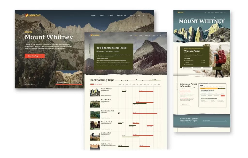
Navigating the complexities of applying for wilderness permits can often feel overwhelming, with the main challenges being keeping track of application dates and specific permit requirements. Lookout was designed to solve these challenges, and provide an informative solution to simplify planning of multi-day hiking trips that require backpacking permits.
Dedicated to decoding the experience found on recreation.gov, Lookout’s website features a user-friendly interface where all the essential details for each permit are neatly assembled. While offering a comprehensive tutorial on what to expect, how and when to apply, and tips to boost the chances of securing a permit.
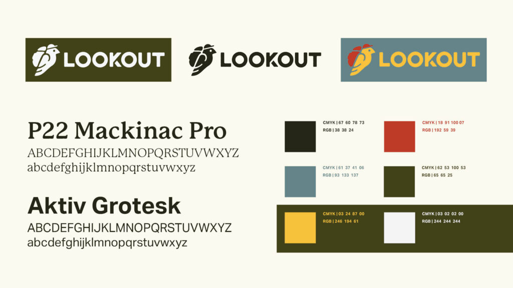
Lookout’s visual identity weaves together vintage style photography that has been collected over years from friends, family, and myself with modern graphics, creating a warm, nostalgic identity that captures the timeless spirit of wilderness exploration. This aesthetic pays tribute to the rich history and breathtaking beauty of outdoors and also resonates with a wide range of nature lovers.
Using these elements across both digital and physical mediums, Lookout aims to be an essential companion for hikers, making the permit application process as delightful as the adventures that await.
Crafting Physical Experiences to Bring the Adventures Back Home
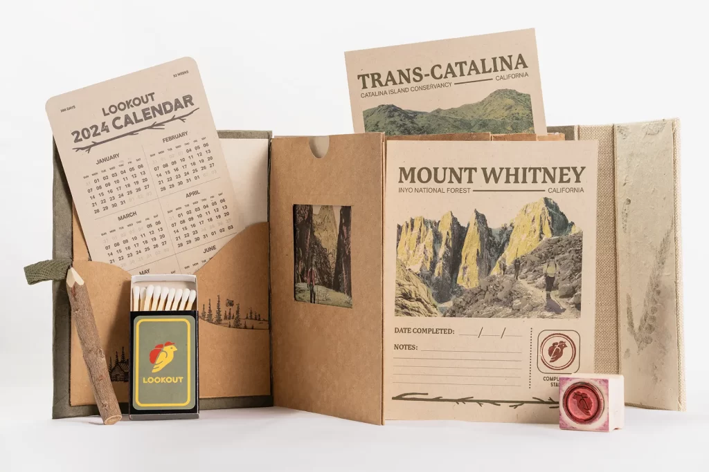
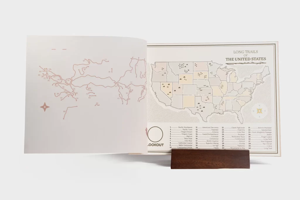
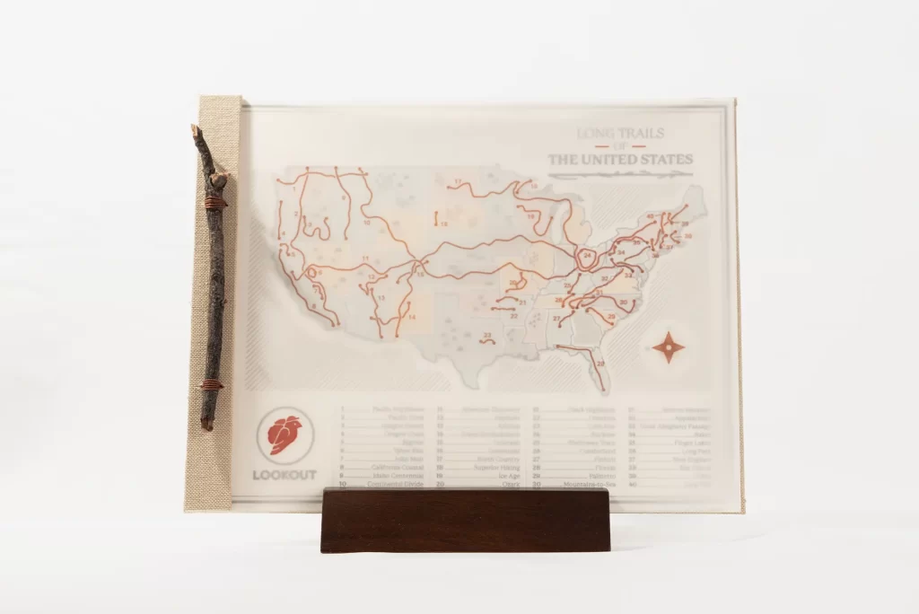
Lookout’s digital presence is enhanced through handcrafted interactive experiences that complement the adventures highlighted on the site. The “Long Trails of the United States” map uncovers the hikers next journey, while the travel sized trail journal becomes a cherished memento of countless trips. Collectible postcards and posters celebrate the post-hike experience by highlighting hiking accomplishments or through sharing notes from just off the trail. These pieces ensure that each step of the journey—from planning to reflection—feels personal, enriching, and aligns with the spirit of exploration that the brand embodies.
The Long Trails of the United States map and Trail Journal were both handcrafted on my bedroom floor using a trusty #11 Exacto blade and a whole lot of PVA glue.
The green and fern-infused paper used for the Trail Journal was sourced from the bark fibre of Lokta, a plant found only in the Eastern Himalayan foothills. The paper making process involves cooking the bark twice, consecutive washing, chopping and beating with wooden hammer. The soft pulp is poured over a wooden-frame and spread evenly by gently shaking the floating frame in water and is then sun dried.
The individual cards in the trail journal are printed on #70 Mohawk Superfine Soft White Eggshell and cut using a laser cutter to get precise curves.
The Long Trails map uses a twig from a local hike I went on while working on this project in Las Vegas. The underlaying map is printed on 70lb. Mohawk Via Linen Natural Paper and the overlay was laser printed on 167 GSM Vellum.