Imprint Branding
Creating an Iconic Identity for the UNLV Graphic Design 2024 Capstone Exhibition
CHALLENGE
Our objective was to create branding for the UNLV Graphic Design 2024 Capstone Exhibition, we wanted to dive into the core of our shared experiences, and to articulate what being a part of the graduating class of 2024 truly signified to the Capstone class.
As our ideas took shape, we realized we weren’t just defining a brand; we were defining our groups collective identity and what we envisioned for our future. This project was about understanding the diverse perspectives and backgrounds of the UNLV Graphic Design program, and how their stories could converge to create something truly unique.
PROJECT ROLE
Art Direction
Web Design
Pitch Deck Design
DESIGNERS
Melody Hernandez
Ryan Pineda
Martina Rodriguez
Ryan Vellinga
SOLUTION
A testament to the resilience and strength found in our imperfections
Imprint is the representation of talents that have not been formed in flawlessness, but in the character that has emerged through our life experiences. It is a challenge, to see beyond the surface, to reflect, to redefine, and to embrace the stories we carry and the imprint we’ll leave behind.
We created a branding that became a symbol of the foundations in which we were built, and our determination to leave a lasting imprint on the world around us.

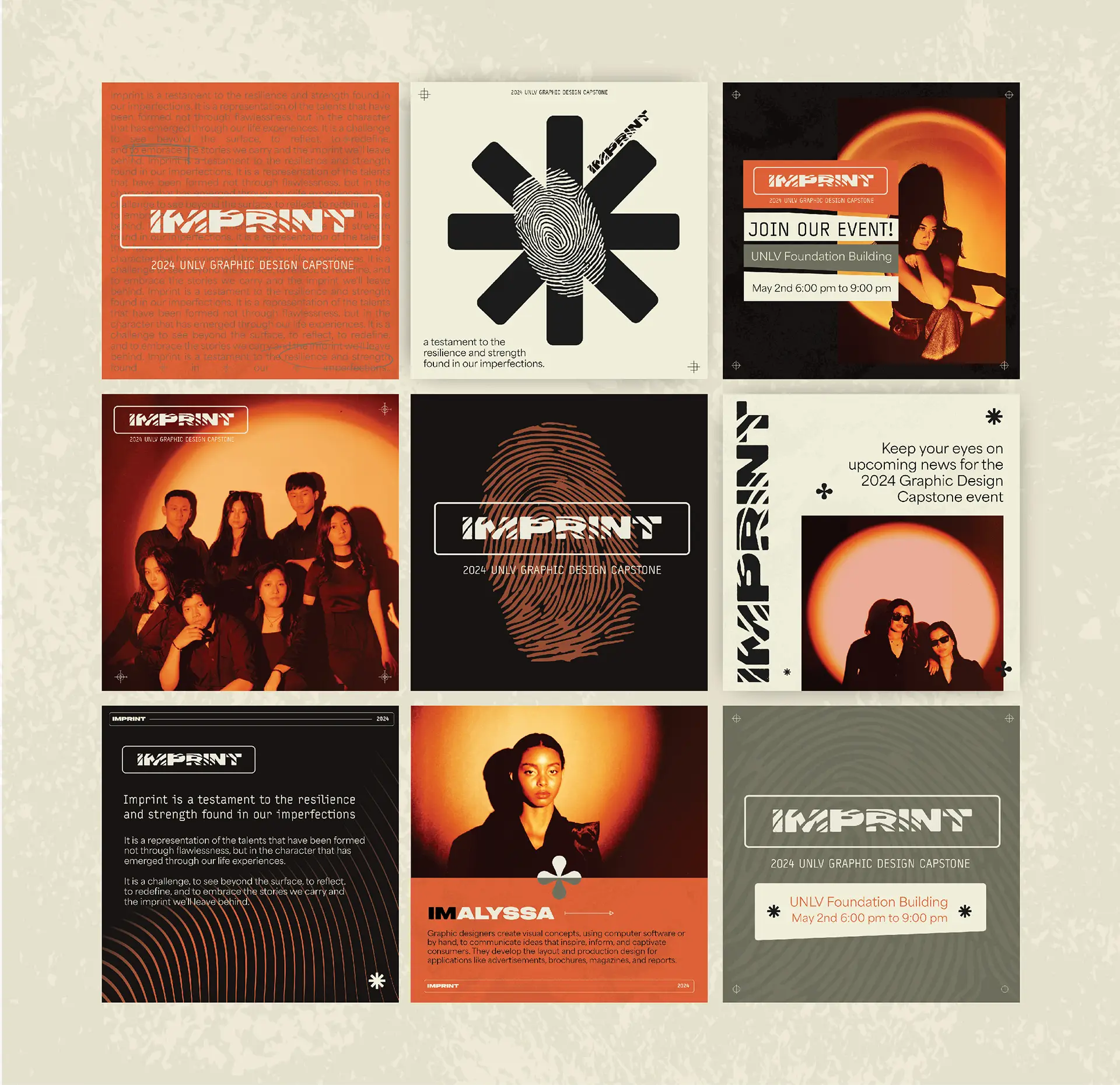

Crafting an impactful pitch
Our goal for Imprint was to break away from the conventions of previous capstone exhibition branding, which no longer resonated with the evolving experiences of our class. The traditional design approaches felt disconnected from the tumultuous realities we had faced—both individually and collectively. It was essential that our branding not only captured our growth through the pandemic but also embodied our unwavering confidence amid political uncertainties and our resilience as we navigated the challenges ahead.
About the Art Direction
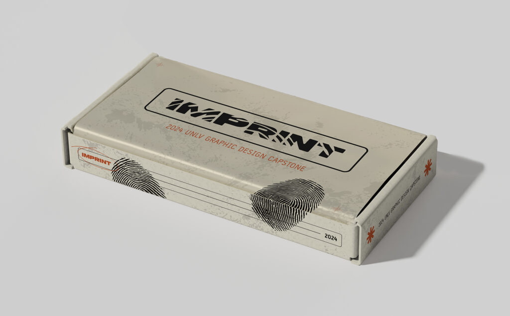
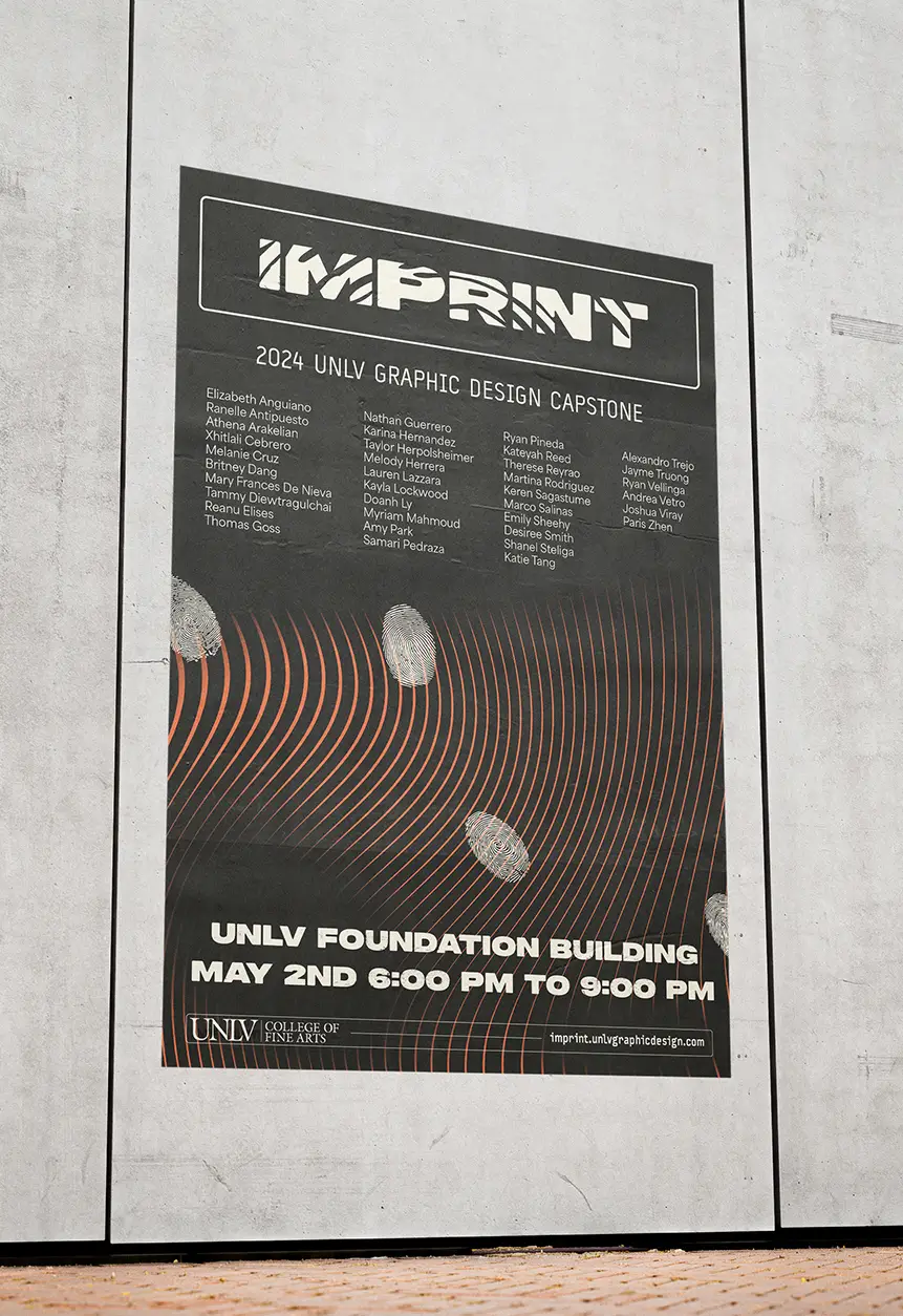
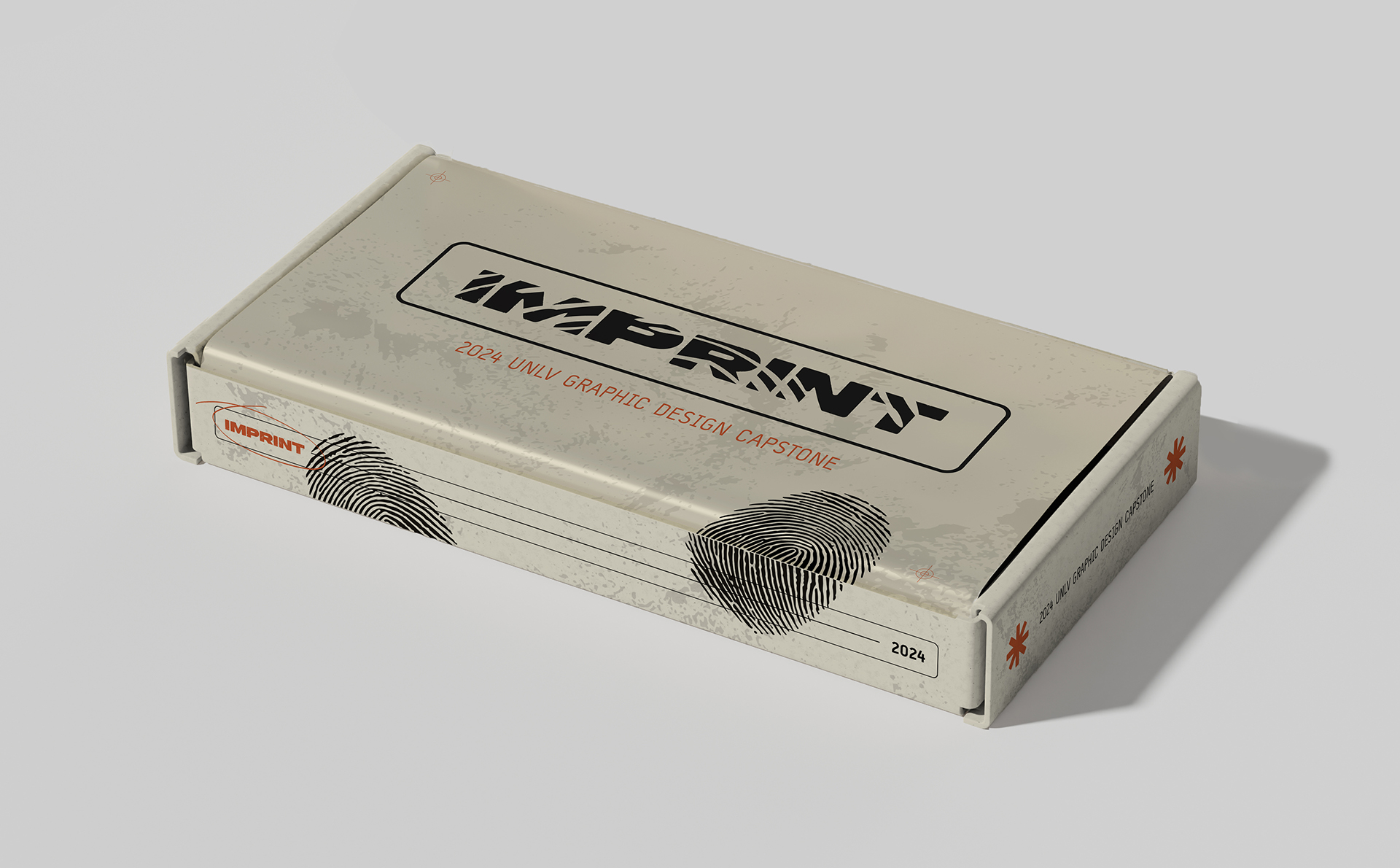
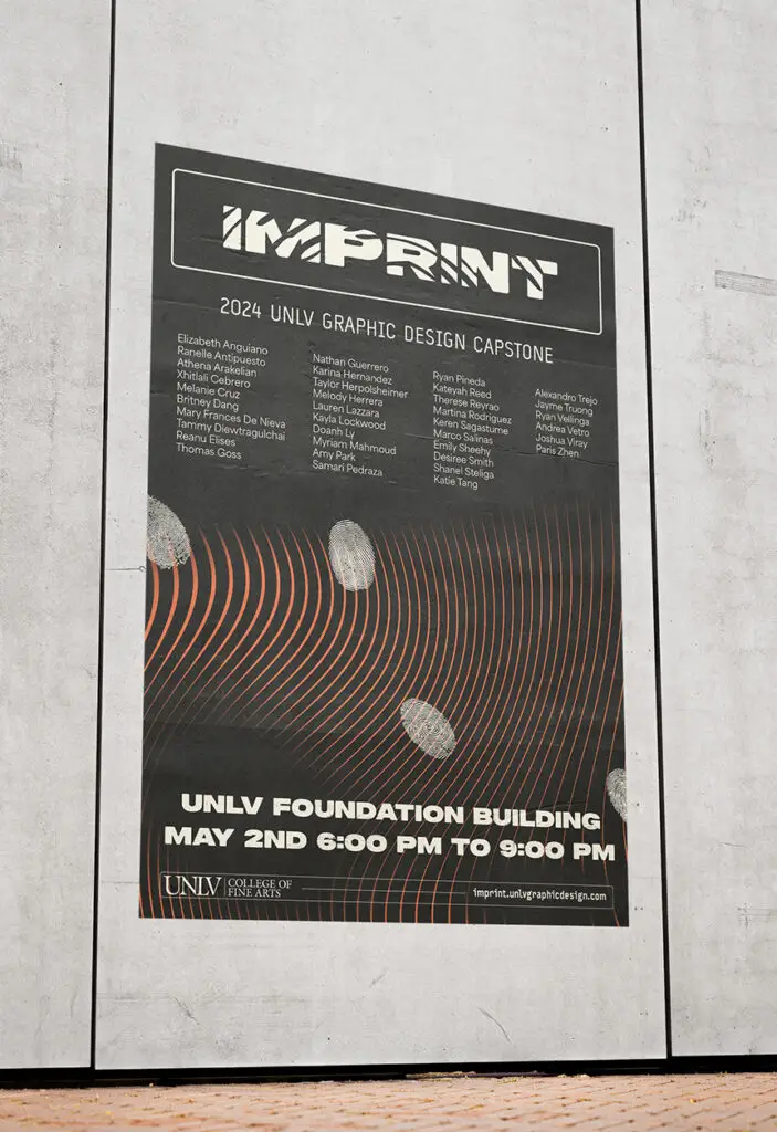
The concept behind Imprint was born from the metaphor of a potter molding clay. Like clay, we were shaped by the pressures and changes of our environment. We adapted, transformed, and ultimately grew stronger. Each obstacle we encountered on the road to graduation left a lasting mark on us, much like the subtle fingerprint left by the potter on their creation. These marks, or imprints, are testaments to our journey and the experiences that have defined us.
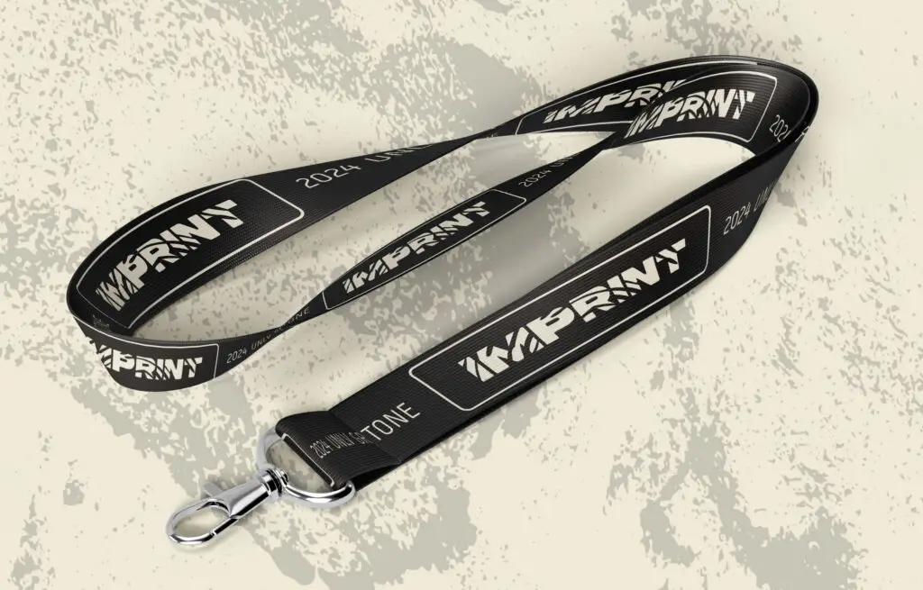
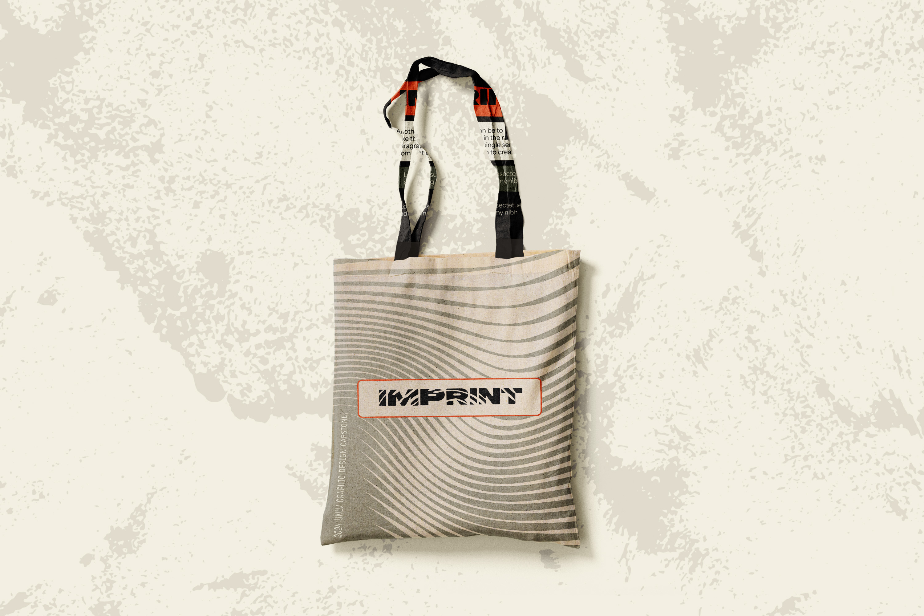
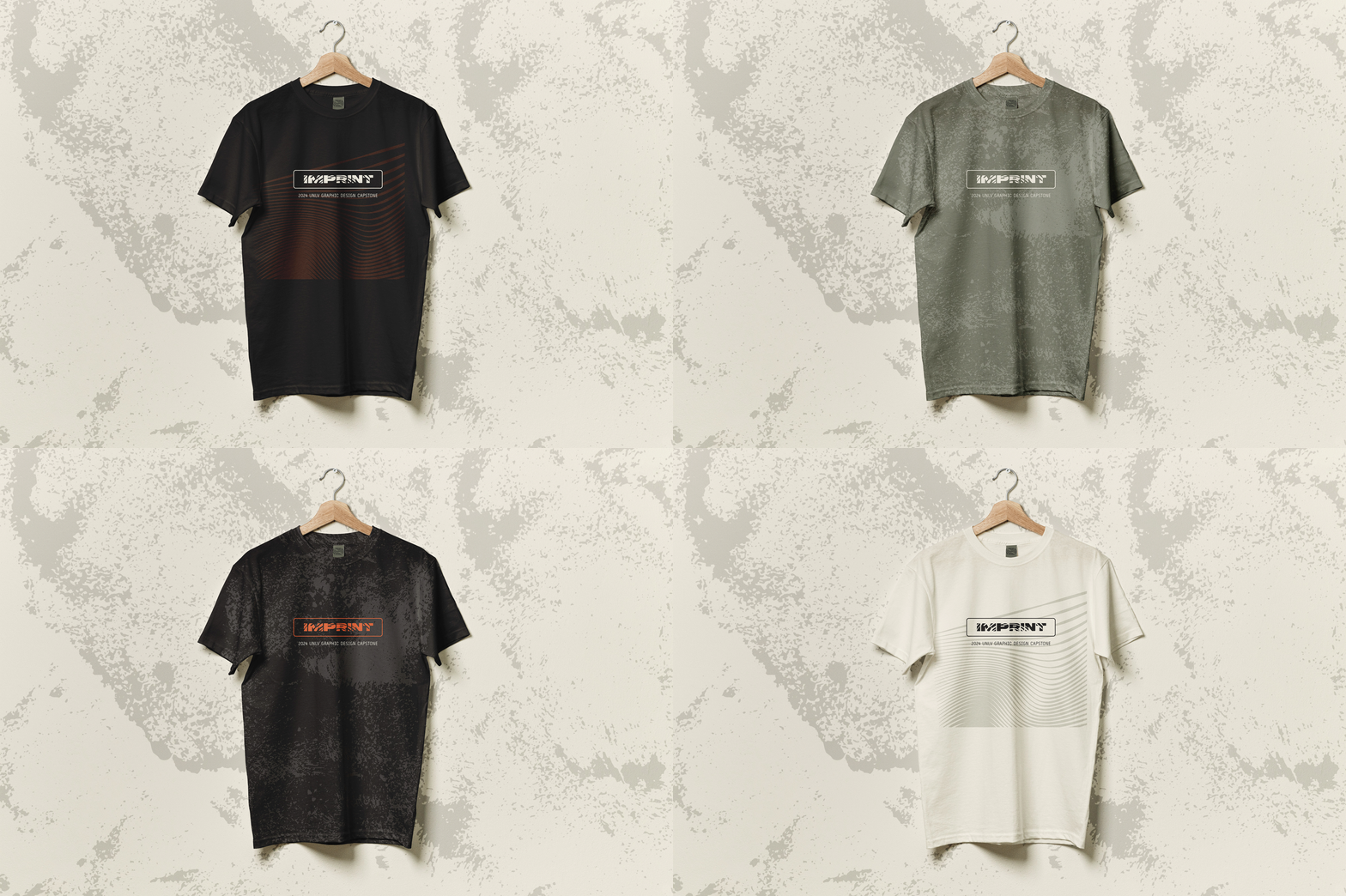
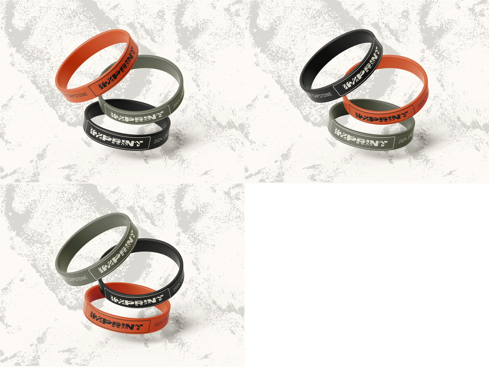
At the heart of Imprint lies a visual identity that refuses to hide its imperfections. Instead, it proudly showcases them as symbols of authenticity and strength. The design is raw, embracing an industrial aesthetic that reflects the unfiltered, genuine nature of our journey. The palette, typography, and overall visual language are purposefully bold, expressing a confident and unapologetic stance—one that acknowledges the scars of the journey we’ve undertaken while looking forward with confidence despite the uncertainties that lie ahead.

Imprint Branding
Creating an Iconic Identity for the UNLV Graphic Design 2024 Capstone Exhibition

CHALLENGE
Our objective was to create branding for the UNLV Graphic Design 2024 Capstone Exhibition, we wanted to dive into the core of our shared experiences, and to articulate what being a part of the graduating class of 2024 truly signified to the Capstone class.
As our ideas took shape, we realized we weren’t just defining a brand; we were defining our group’s collective identity and what we envisioned for our future. This project was about understanding the diverse perspectives and backgrounds of the UNLV Graphic Design program, and how their stories could converge to create something truly unique.
PROJECT ROLE
Art Direction
Web Design
Pitch Deck Design
DESIGNERS
Melody Hernandez
Ryan Pineda
Martina Rodriguez
Ryan Vellinga
SOLUTION
A testament to the resilience and strength found in our imperfections
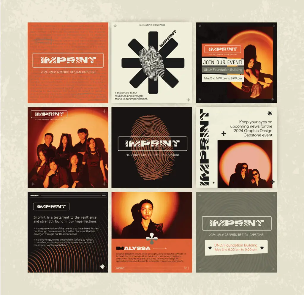
Imprint is the representation of talents that have not been formed in flawlessness, but in the character that has emerged through our life experiences. It is a challenge, to see beyond the surface, to reflect, to redefine, and to embrace the stories we carry and the imprint we’ll leave behind.
We created a branding that became a symbol of the foundations in which we were built, and our determination to leave a lasting imprint on the world around us.

About the Art Direction
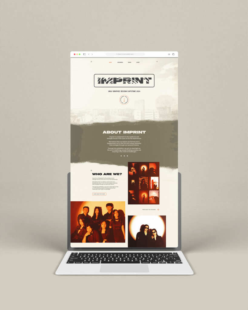
The concept behind Imprint was born from the metaphor of a potter molding clay. Like clay, we were shaped by the pressures and changes of our environment. We adapted, transformed, and ultimately grew stronger. Each obstacle we encountered on the road to graduation left a lasting mark on us, much like the subtle fingerprint left by the potter on their creation. These marks, or imprints, are testaments to our journey and the experiences that have defined us.
At the heart of Imprint lies a visual identity that refuses to hide its imperfections. Instead, it proudly showcases them as symbols of authenticity and strength. The design is raw, embracing a hand-crafted aesthetic that reflects the unfiltered, genuine nature of our journey. The palette, typography, and overall visual language are purposefully bold, expressing a confident and unapologetic stance—one that acknowledges the scars of the journey we’ve undertaken while looking forward with confidence despite the uncertainties that lie ahead.
