Breakthru Beverage B2B Catalog
Elevating a B2B Catalog for Better Communication
CHALLENGE
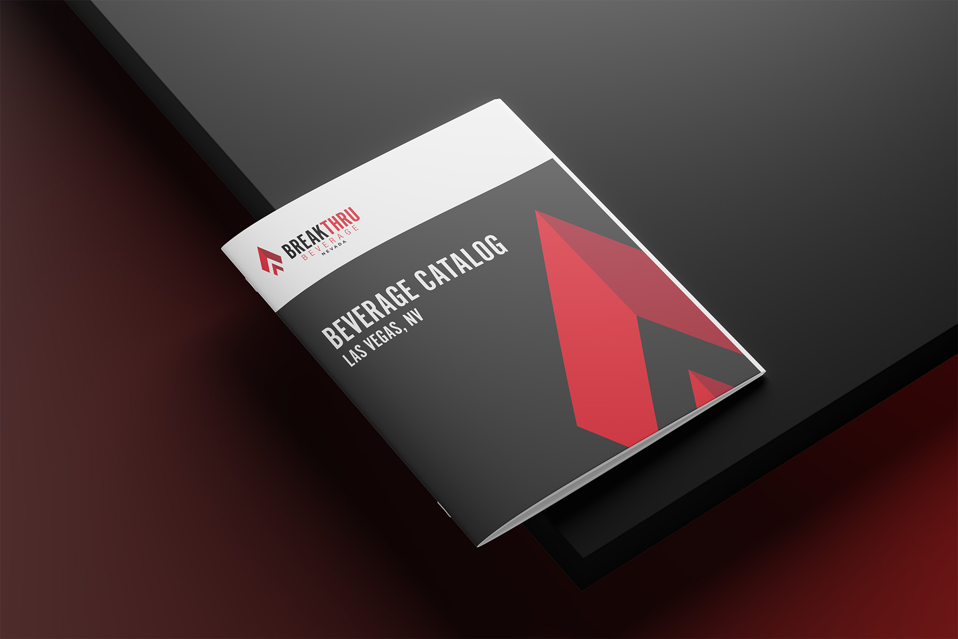
Breakthru Beverage Group Nevada recognized the need to refresh one of their essential B2B beverage catalogs for their Las Vegas and Reno markets. The previous iteration of the catalog faced several challenges, including readability issues and a lack of consistency with the company’s established brand guidelines. These issues not only impacted the user experience but also posed a risk to the company’s brand image, as the document failed to effectively communicate the quality and professionalism that Breakthru Beverage Group aims to embody.
SOLUTION
Redesigning for Clarity and Brand Consistency
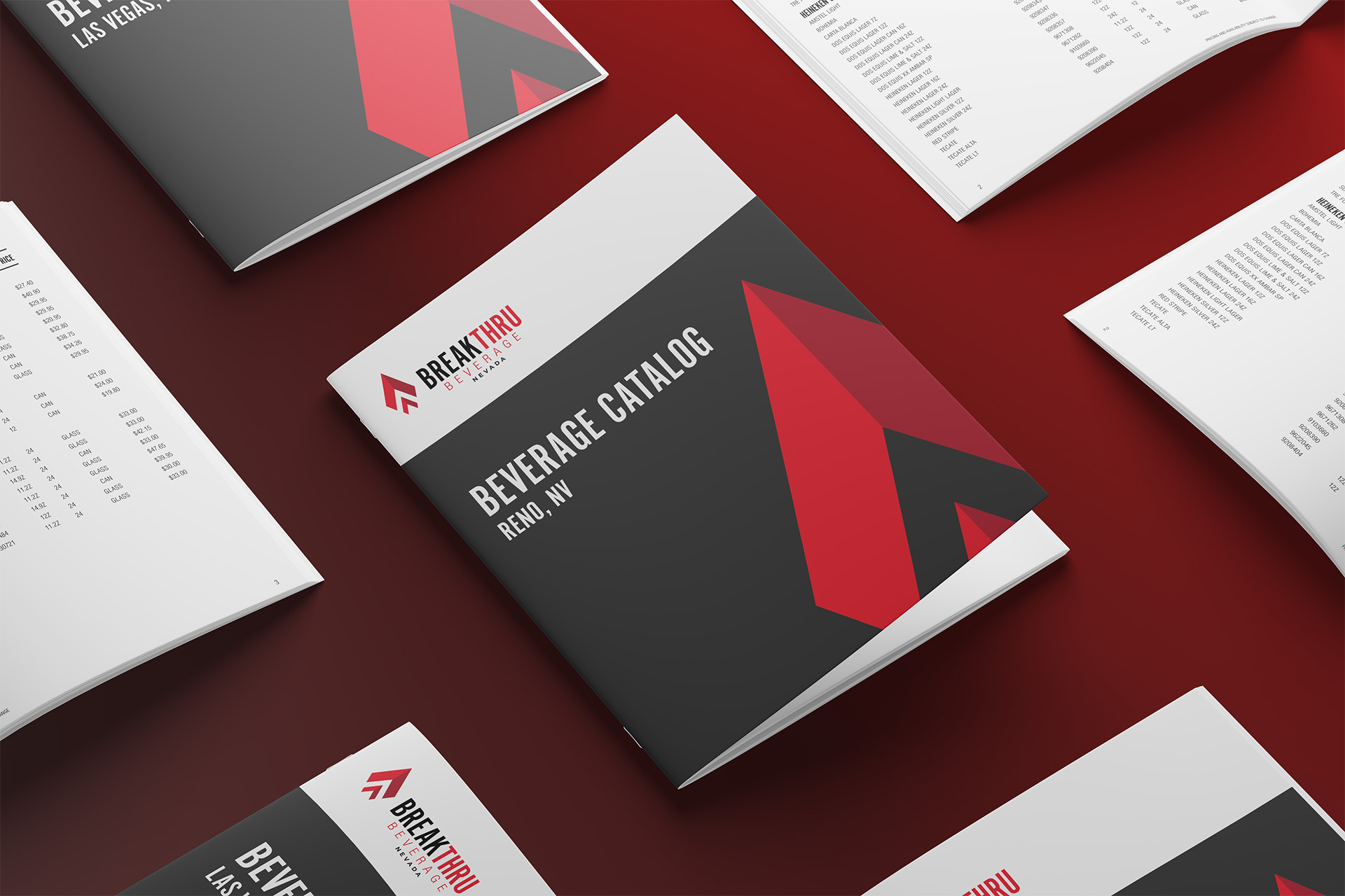
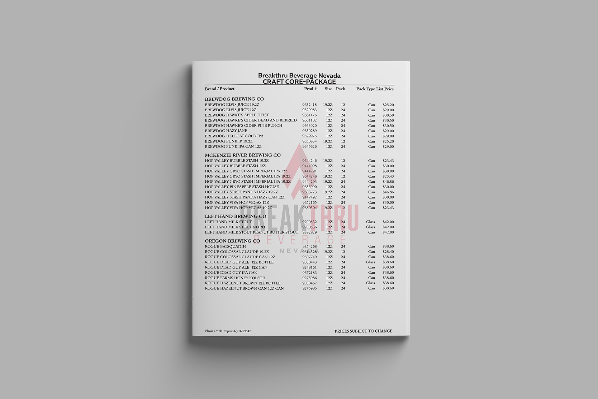
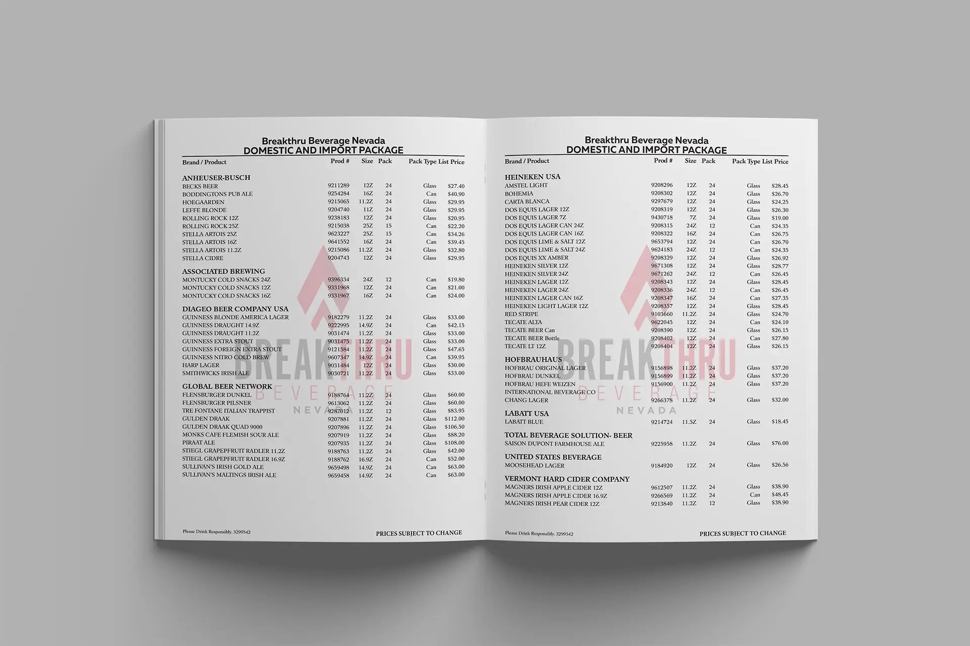
My role was to overhaul the catalog, ensuring it was both visually appealing and functionally effective. I focused on creating a clean, modern layout that aligned with the brand’s visual identity, improving readability through strategic typography, spacing, and hierarchy. By developing an intuitive structure and refining the catalog’s design elements, I aimed to deliver a streamlined and cohesive user experience that met the needs of their clients while reinforcing Breakthru’s brand presence in the competitive beverage market.
Breakthru Beverage B2B Catalog
Elevating the B2B Catalog for Better Communication

CHALLENGE
Breakthru Beverage Group Nevada recognized the need to refresh one of their essential B2B beverage catalogs for their Las Vegas and Reno markets. The previous iteration of the catalog faced several challenges, including readability issues and a lack of consistency with the company’s established brand guidelines. These issues not only impacted the user experience but also posed a risk to the company’s brand image, as the document failed to effectively communicate the quality and professionalism that Breakthru Beverage Group aims to embody.


SOLUTION
Redesigning for Clarity and Brand Consistency
My role was to overhaul the catalog, ensuring it was both visually appealing and functionally effective. I focused on creating a clean, modern layout that aligned with the brand’s visual identity, improving readability through strategic typography, spacing, and hierarchy. By developing an intuitive structure and refining the catalog’s design elements, I aimed to deliver a streamlined and cohesive user experience that met the needs of their clients while reinforcing Breakthru’s brand presence in the competitive beverage market.
